There are many aspects that play a role in how all decisions to a design is conducted or how an idea is conceived. To start with, how designers approach problems are comparable to how doctors set about with patients, and how both arrive at their diagnoses. The designer, like the doctor, listens with care to the stories of the patients (the commissioners); in their stories are important clues for making initial diagnoses, which then direct to possible solutions. These clues set off a series of raw ideas. The ability to detect these clues or keywords is a trained skill that doctors or designers acquired by experience, and by having knowledge on the subject. This is just the first step, the initial diagnoses need to be checked and tested before proceeding onto the next phase.
Creativity, as stated earlier, is only one of the aspects of design. How designers access creativity is partly explained by the ability of making free associations. This ability is a skill largely acquired from training. Thus, one of the tasks of design education is to nurture this skill of free association; there are various methods aimed at achieving this goal. Methods such as brainstorming, mind mapping, Six Thinking Hats, and more are designed to train the mind to let loose, to challenge the status quo in making the next step.
There is as well inspiration to speak of. Inspiration and idea are all around us if we know where to seek and how to recognize it. If one were to look in the common place, the visual outcome can be expected as the expected. On the other hand, if one were to search for ideas in domains that are either unexplored or unrelated to the researched subject, and to translate the finding back into the research, one has a better chance of arriving at a surprising result. For instance, hardware stores or a walk in the park might be better sources for ideas than the ones printed in design books. Flipping through design books limits the mind to the visual solutions of the others. It is better to use design books for the purpose of having knowledge on what is already out there, thus, similar or identical design solutions can be prevented—if that poses a problem—. And the commissioner can be protected from producing a product that already exists in the market.
After the conception of a design is settled, the aspect of the visual surface treatment comes into play. ‘Beauty’ is an argumentative and controversial subject. How beauty is defined is neither universal nor timeless; there are social, cultural aspects involved, as well as, personal tastes and generational differences. At some point in the design process, a designer will need to synchronize aesthetic, editorial content, and functionality. At our office, what we keep in mind when balancing these three aspects is that the latter, functionality, is of our primary concern. The role of aesthetic is to attract, if necessary, and to radiate value. Aesthetic can even emerge from functionality, an object that functions well both in its content and in its mechanism can start to look beautiful. Being subjective, aesthetic does not have a distinct set of rules to follow, apart from generalizations such as refined proportions. Functionality, on the other hand, can be guided by the Gestalt Laws on visual information; with the basic principles such as simplicity in forms, clarity in editorial organization, recognizable structure, clear hierarchy and so on; to help the users at better accessing the design.
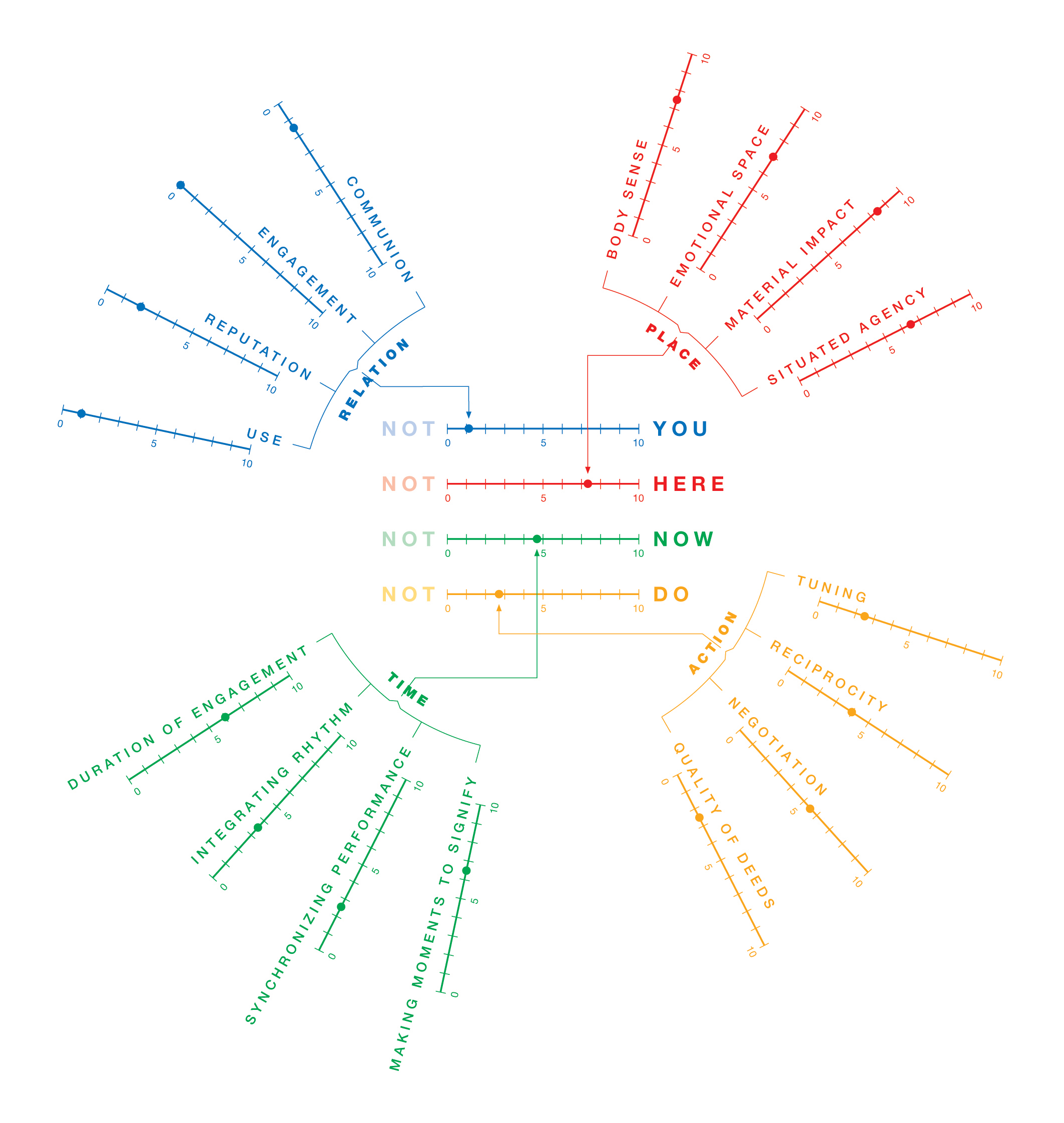
Another aspect that effects our design decision is the user’s ability to comprehend and process the content. The typography and layout of the scheme our office has created for the ‘YUTPA framework’, is an example of where the user’s ability to process this complex and varied information plays an important role in shaping the visual outcome. The scheme’s complex content calls for an as clear and as visually accessible structure as possible. There are 16 different elements presented in this scheme. The editorial decision by the writer to group these 16 elements into four chunks is an appropriate one. The reason being, there is a limit to the capacity of the working memory of an adult; seven elements is the maximum. To make it easier or faster to comprehend, these seven elements can be further grouped into chunks. In the visual structure of the ‘YUTPA framework’, the colour and placement of the four chunks support this knowledge. Each of the four chunks in the scheme contains four elements; for the readers to comprehend the data and to avoid confusion, it would have been better if the number of elements in each chunk were unique numbers instead of the number four, which is identical to the number of chunks.